
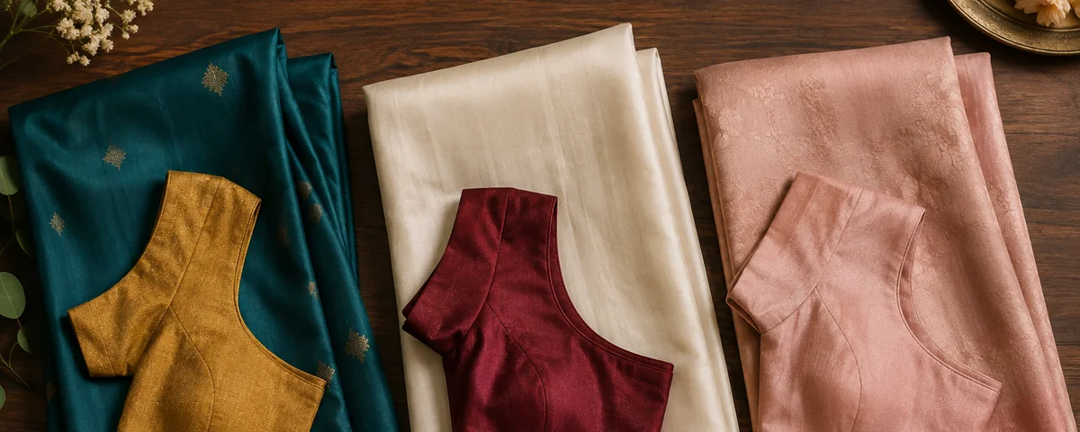
A customer from Whitefield came in with a plain ivory Kanjivaram for her sister's reception and two blouse swatches — one ivory to match, one a deep maroon for contrast — and had been going back and forth between them for two weeks. She wanted us to just decide for her. The honest answer was neither swatch alone; the maroon was right, but the shade she had picked skewed too pink under the reception's warm lighting, and we swapped it for a slightly deeper wine that would hold its colour under both daylight and evening light. Saree blouse colour combinations are rarely a simple match-or-contrast choice — the saree's weave, the embroidery on both pieces, and the light the outfit will actually be seen under all change which pairing works. This guide covers how to choose a colour combination that holds up beyond the shop mirror.
Should Your Blouse Match or Contrast Your Saree?
Match when the saree is heavily worked and you want one cohesive outfit. Go tonal — the same colour family, a shade deeper or lighter — when you want visual interest without a hard break. Contrast only when the saree has a plain or lightly worked body, because a contrast blouse against a plain field reads as a decision, while a contrast blouse against dense zari competes with it.
- Matching blouse — same colour, coordinated design. The safest, most traditional option, and the only one that works on very heavily worked silk without the two pieces fighting for attention.
- Tonal blouse — the same colour family, a shade deeper or lighter than the saree. The most forgiving choice, and the one I recommend most often when a customer is unsure.
- Contrast blouse — a deliberately different colour, usually one already present in the saree's border or embroidery thread. Works best on plain or lightly worked silk, chiffon, or georgette.
The rule I give every customer choosing contrast: the blouse colour should already exist somewhere in the saree — a thread in the border, the colour of the zari, an accent in the pallu. A contrast that borrows nothing from the saree reads as a mismatch bought separately, even if the two colours look fine side by side on their own. This is the same match-tonal-contrast framework we use for matching a bridal blouse to a lehenga, adapted for how a saree drapes rather than how a lehenga skirt sits.
Saree Blouse Colour Combinations for Silk Sarees
Kanjivaram and Banarasi (heavy zari silks)
Heavy zari silks carry their own colour statement, so the safest combinations pull one colour directly out of the saree's border rather than introducing a new one. A deep maroon Kanjivaram with a mustard-gold blouse, an emerald Kanjivaram with a deep pink or rani blouse pulled from the border thread, or a navy Banarasi with a rust-orange blouse — these work because the blouse colour is already sitting in the weave, just not as the dominant shade. Bridal blouse designs for Kanjivaram sarees goes further into how neckline and embroidery should follow the same logic.
Plain or lightly worked silk
This is where genuine contrast has the most room to work, because there is no dense pattern for the new colour to compete with. A plain wine silk with a bottle-green blouse, or a dove-grey silk with a deep berry blouse, both read as considered rather than accidental. Save the boldest contrast pairings for a saree with the least going on already.
Pastel and chiffon sarees
Pastels need a tonal approach more than a contrast one — a hard contrast against a soft pastel base can look like two different outfits stitched together. A blush chiffon with a slightly deeper rose blouse, or a mint saree with a sage-green blouse, keep the outfit reading as one considered palette rather than two unrelated decisions.
How Occasion and Lighting Change the Colour Decision
Choose your final shade under the light the event will actually happen in, not showroom lighting. A daytime ceremony under natural Bangalore sunlight reads colours true and can carry sharper contrast. An evening reception under warm artificial lighting shifts colours warmer and can turn a bright pink muddy or a true red orange — the maroon swatch in the opening story is a case of exactly this. Bring your saree to a window before finalising a blouse shade, because daylight is the only light that tells you the truth about a colour.
If the same outfit has to work for both a daytime function and an evening reception, choose a shade that sits mid-tone rather than at either extreme — a very pale or a very saturated colour is the most likely to shift unpredictably between the two lighting conditions.
How Embroidery Colour Should Relate to the Blouse and Saree
Match the embroidery metal tone — gold or silver — across the blouse and the saree before worrying about the base colour at all. A gold zari saree paired with a blouse worked in silver thread is the fastest way to make two well-chosen colours look like they do not belong together, because the metal tones argue even when the fabric colours agree.
- Gold zari saree — pair with gold or copper-toned embroidery on the blouse, even if the blouse fabric itself is a contrast colour.
- Silver or white zari saree — pair with silver or white thread work; gold reads as a mismatch even on an otherwise well-matched colour.
- Coloured thread work (resham, aari) — match the thread colour to an accent already in the saree, the same rule as choosing the blouse fabric colour itself.
If you want an exact tonal match rather than choosing from ready-dyed fabric on the shelf, we can get a swatch custom-dyed to match your saree at our Bangalore studio — but that adds 5 to 7 days to the timeline, so it needs deciding at the first consultation, not at the trial fitting. Before committing to heavy contrast embroidery, it is worth reading what heavy hand embroidery is actually worth on a bridal blouse, since a densely worked contrast blouse is priced closer to ₹4,000 to ₹9,000 depending on the technique, well above a simple coordinated one. The colour decision is really one part of the larger design brief — how to choose the right blouse design for your wedding saree covers how colour, neckline and embroidery should be briefed together rather than decided one at a time. Bring the saree in and we will hold thread and fabric shades against it in person — that happens at every custom stitching consultation.
Frequently Asked Questions
Should a blouse match or contrast the saree colour?
Match when the saree is heavily worked, so the outfit reads as one cohesive piece. Contrast only when the saree body is plain or lightly worked, and pick a contrast colour that already exists somewhere in the saree's border or thread work. A tonal choice — the same colour family, a shade deeper or lighter — is the safest option when unsure; if you want an exact tonal match dyed specifically for your saree, that takes 5 to 7 days to prepare at our Bangalore studio.
What blouse colour goes with a red or maroon bridal saree?
Gold or mustard, worked in the same gold zari as the saree border, is the classic and safest contrast for a red or maroon saree. A deep bottle-green or a rich teal also works well if the saree has any green or blue in its woven pattern. Avoid a second shade of red or pink that is close but not identical — that pairing, priced the same as any coordinated blouse at ₹1,500 to ₹4,000, is the one most likely to look like a mismatch rather than a deliberate contrast.
Does gold or silver zari embroidery change which blouse colours work?
It changes the embroidery thread colour more than the base fabric colour. A gold zari saree should be paired with gold or copper embroidery on the blouse, and a silver or white zari saree with silver or white thread work. Mixing metal tones is one of the most common colour mistakes we see, even when the underlying fabric colours are well chosen.
Can I get a blouse dyed to match my saree exactly?
Yes. At Akira Fashion Studio in Bangalore, we can get a fabric swatch custom-dyed to match your saree when a ready-dyed shade is not close enough. This adds 5 to 7 days to the production timeline, so it needs to be decided at the first consultation rather than discovered as a problem at the trial fitting.
What colour blouse works best for a daytime ceremony versus an evening reception?
Choose the final shade under natural daylight, since warm reception lighting (typically 2700 to 3000K, well warmer than daylight) shifts bright colours — a true red can read orange, a bright pink can read muddy. If one blouse has to serve both a daytime function and an evening reception, a mid-tone shade holds its colour more reliably under both types of light than a very pale or very saturated one.